Markets
All of the World’s Money and Markets in One Visualization


All of the World’s Money and Markets in One Visualization
In the current economic circumstances, there are some pretty large numbers being thrown around by both governments and the financial media.
The U.S. budget deficit this year, for example, is projected to hit $3.8 trillion, which would be more than double the previous record set during the financial crisis ($1.41 trillion in FY2009). Meanwhile, the Fed has announced “open-ended” asset-buying programs to support the economy, which will add even more to its current $7 trillion balance sheet.
Given the scale of these new numbers—how can we relate them back to the more conventional numbers and figures that we may be more familiar with?
Introducing the $100 Billion Square
In the above data visualization, we even the playing field by using a common denominator to put the world’s money and markets all on the same scale and canvas.
Each black square on the chart is worth $100 billion, and is not a number to be trifled with:
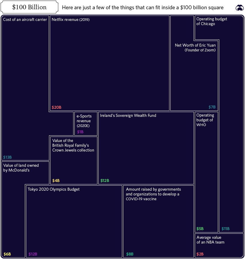
In fact, the entire annual GDP of Cuba could fit in one square ($97 billion), and the Greek economy would be roughly two squares ($203 billion).
Alternatively, if you’re contrasting this unit to numbers found within Corporate America, there are useful comparisons there as well. For example, the annual revenues of Wells Fargo ($103.9 billion) would just exceed one square, while Facebook’s would squeeze in with room to spare ($70.7 billion).
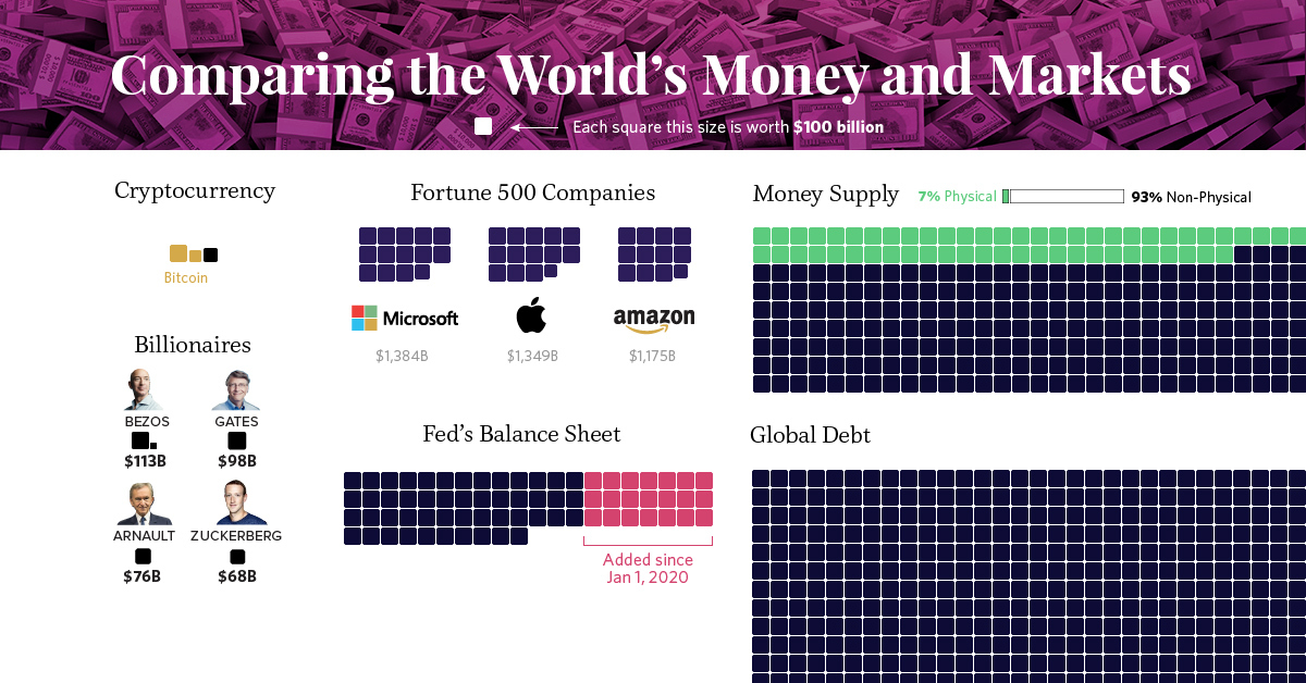
Billions, Trillions, or Quadrillions?
Here’s our full list, which sums up all of the world’s money and markets, from the smallest to the biggest, along with sources used:
| Category | Value ($ Billions, USD) | Source |
|---|---|---|
| Silver | $44 | World Silver Survey 2019 |
| Cryptocurrencies | $244 | CoinMarketCap |
| Global Military Spending | $1,782 | World Bank |
| U.S. Federal Deficit (FY 2020) | $3,800 | U.S. CBO (Projected, as of April 2020) |
| Coins & Bank Notes | $6,662 | BIS |
| Fed's Balance Sheet | $7,037 | U.S. Federal Reserve |
| The World's Billionaires | $8,000 | Forbes |
| Gold | $10,891 | World Gold Council (2020) |
| The Fortune 500 | $22,600 | Fortune 500 (2019 list) |
| Stock Markets | $89,475 | WFE (April 2020) |
| Narrow Money Supply | $35,183 | CIA Factbook |
| Broad Money Supply | $95,698 | CIA Factbook |
| Global Debt | $252,600 | IIF Debt Monitor |
| Global Real Estate | $280,600 | Savills Global Research (2018 est.) |
| Global Wealth | $360,603 | Credit Suisse |
| Derivatives (Market Value) | $11,600 | BIS (Dec 2019) |
| Derivatives (Notional Value) | $558,500 | BIS (Dec 2019) |
| Derivatives (Notional Value - High end) | $1,000,000 | Various sources (Unofficial) |
Derivatives top the list, estimated at $1 quadrillion or more in notional value according to a variety of unofficial sources.
However, it’s worth mentioning that because of their non-tangible nature, the value of financial derivatives are measured in two very different ways. Notional value represents the position or obligation of the contract (i.e. a call to buy 100 shares at the price of $50 per share), while gross market value measures the price of the derivative security itself (i.e. $1.00 per call option, multiplied by 100 shares).
It’s a subtle difference that manifests itself in a big way numerically.
Correction: Graphic updated to reflect the average value of an NBA team.


Markets
The Growth of a $1,000 Equity Investment, by Stock Market
In this graphic, we’ve visualized stock market growth by country over the past five years using major indices.
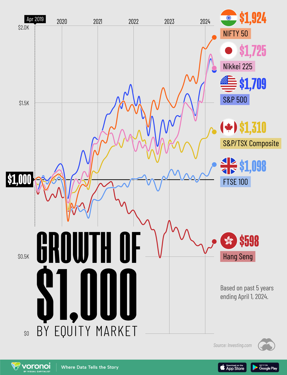
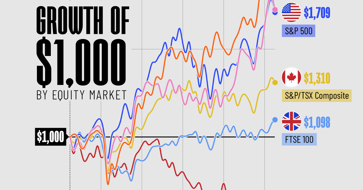
Visualizing Stock Market Growth by Country
This was originally posted on our Voronoi app. Download the app for free on iOS or Android and discover incredible data-driven charts from a variety of trusted sources.
In this graphic, we show the change in value of a $1,000 investment in various leading equity indexes from around the world. This data was sourced from Investing.com, and covers a five-year period from April 2019 to April 2024.
See the following table for the five-year annual return figures of the indexes shown above.
| Index | 5-Yr Return as of April 1, 2024 |
|---|---|
| 🇮🇳 NIFTY 50 | 92.4% |
| 🇯🇵 Nikkei 225 | 72.5% |
| 🇺🇸 S&P 500 | 70.9% |
| 🇨🇦 S&P/TSX Composite | 31.0% |
| 🇬🇧 FTSE 100 | 9.8% |
| 🇭🇰 Hang Seng | -40.2% |
In terms of stock market growth by country, India (represented here by the NIFTY 50) has impressively surpassed both the U.S. and Japan.
What is the NIFTY 50?
The NIFTY 50 is an index of the 50 largest and most actively traded Indian stocks. Similar to the S&P 500, it represents a range of industries and acts as a benchmark for investors to gauge the performance of the country’s broader stock market.
What’s Going on in India?
India’s multi-year bull market has led to several records being shattered in 2023. For example, the country’s total stock market market capitalization surpassed $4 trillion for the first time, while India-focused ETFs pulled in net inflows of $8.6 billion over the year.
A primary driver of this growth is the country’s fast-rising middle class. According to a report by Morgan Stanley, this “once-in-a-generation shift” will result in India having the third largest stock market globally by 2030, presumably behind the U.S. and China.
Japan Also Breaks Records
Japanese equities (represented in this graphic by the Nikkei 225) slightly outperformed the S&P 500 over the past five years. The index, which represents the top 225 companies on the Tokyo Stock Exchange, recently set a new record high for the first time since 1989.
Japanese companies have reported strong earnings as of late, partly thanks to a weak yen, which benefits many of the country’s export-reliant companies.
Learn More About Global Markets From Visual Capitalist
If you enjoyed this graphic, be sure to check out The World’s Biggest Stock Markets, by Country, which provides a unique perspective on country-level market capitalizations.

-

 Energy6 days ago
Mapped: The Age of Energy Projects in Interconnection Queues, by State
-

 AI2 weeks ago
Visualizing AI Patents by Country
-

 Markets2 weeks ago
Economic Growth Forecasts for G7 and BRICS Countries in 2024
-

 Wealth2 weeks ago
Charted: Which City Has the Most Billionaires in 2024?
-

 Technology2 weeks ago
All of the Grants Given by the U.S. CHIPS Act
-

 Green1 week ago
The Carbon Footprint of Major Travel Methods
-

 United States1 week ago
Visualizing the Most Common Pets in the U.S.
-

 Culture1 week ago
The World’s Top Media Franchises by All-Time Revenue